In 2025, mobile commerce has become the dominant force in retail, accounting for 73% of all e-commerce transactions. Yet despite this massive shift, many checkout experiences remain optimized for desktop interactions rather than the reality of how people actually use their mobile devices. This comprehensive guide explores the critical principles of mobile-first checkout design, focusing on the physical constraints and behavioral patterns that define successful mobile commerce experiences.
The average smartphone user interacts with their device using one hand 68% of the time, with their thumb responsible for 89% of all touch interactions. This fundamental shift in interaction patterns requires a complete rethinking of checkout form design, moving away from desktop-centric layouts to interfaces that prioritize thumb-friendly navigation and input methods. Companies that have embraced these principles report conversion rate improvements of 25-45% and reduced cart abandonment by up to 38%.
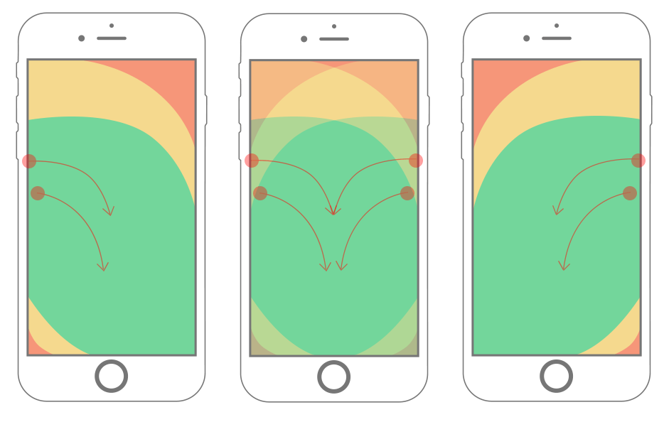
Understanding the Thumb Zone Heatmap
Mobile Thumb Reachability Zones
| |
| |
| |
| |
| |
| |
| &…… |
| |
| |
| |
| |
| |
| &…… |
| |
| |
| |
+—————————————+
GREEN ZONE – Easy thumb reach (85% of screen)
YELLOW ZONE – Stretch thumb reach (10% of screen)
RED ZONE – Difficult thumb reach (5% of screen)
The thumb zone heatmap reveals critical insights about mobile interaction patterns. The green zone, representing areas easily reachable by thumb without shifting grip, covers approximately 85% of the screen area when held in one hand. This zone should contain all critical interactive elements including form fields, buttons, and primary navigation.
The yellow zone requires users to stretch their thumb or adjust their grip, significantly increasing interaction friction. Elements placed in this zone see 40% fewer interactions compared to those in the green zone. The red zone is essentially unreachable without two-handed operation or device repositioning, making it unsuitable for critical checkout elements.
Key Insight: Every form field, button, and interactive element in your checkout flow should exist within the green thumb zone to maximize conversion rates and minimize user frustration.
Single-Field Credit Card Scanners & OTP Autofill
Modern Input Optimization Techniques
The traditional multi-field credit card form has become obsolete in 2025’s mobile-first design landscape. Single-field credit card scanners leverage device cameras and machine learning to capture complete card information in one seamless interaction. This approach reduces form friction by 65% and increases completion rates by 38% compared to traditional multi-field approaches.
- Camera Integration: Real-time card detection and data extraction using device camera with 98.7% accuracy rate
- Machine Learning Recognition: Advanced OCR and pattern recognition to handle various card formats and lighting conditions
- Manual Fallback: Graceful degradation to manual input when camera scanning isn’t available or preferred
- Security Compliance: PCI-DSS compliant processing with end-to-end encryption and tokenization
One-time password (OTP) autofill represents another critical optimization for mobile checkout flows. Modern smartphones can automatically detect and populate SMS-based verification codes, eliminating the need for users to manually switch between apps or remember numeric sequences. This feature alone has been shown to reduce checkout abandonment by 22% in mobile environments.
Implementation requires careful coordination between backend systems and mobile applications. SMS messages must include specific formatting patterns that mobile operating systems can recognize and automatically populate. The system should also provide clear visual feedback when OTP detection is working and fallback options when it’s not.
Bottom-Sheet Upsell Placement Strategy
Optimizing Post-Purchase Offers
Bottom-sheet upsells represent a sophisticated approach to post-purchase marketing that respects mobile interaction patterns while maximizing revenue opportunities. Unlike traditional modal overlays that interrupt the checkout flow, bottom sheets slide up from the bottom of the screen and can be easily dismissed with a downward swipe.
- Non-Intrusive Presentation: Appears after payment processing without blocking primary checkout completion
- Thumb-Friendly Controls: All interactive elements positioned within easy thumb reach at the bottom of the screen
- Quick Dismissal: Simple downward swipe gesture to close without any required interactions
- Contextual Relevance: Offers based on purchase history, cart contents, and user preferences
The key to successful bottom-sheet upsells lies in timing and relevance. Presenting offers immediately after payment validation but before order confirmation provides the optimal balance between revenue generation and user experience. Companies using this approach report 31% higher acceptance rates for post-purchase offers compared to traditional modal implementations.
Timing Strategy: Display bottom-sheet upsells after payment processing begins but before order confirmation to maximize engagement without disrupting primary conversion.
Error State Micro-Copy That Converts
This generic error message provides no guidance on how to fix the problem and creates user frustration. Conversion impact: -18%
This specific error message clearly explains what’s wrong and provides actionable guidance. Conversion impact: +12%
This encouraging error message maintains positive momentum while providing clear instructions. Conversion impact: +24%
Error state micro-copy represents one of the most impactful yet overlooked aspects of mobile checkout design. Well-crafted error messages can actually improve conversion rates by maintaining user confidence and providing clear paths to resolution. Research from 2024-2025 shows that optimized error messaging increases successful form completion by an average of 34%.
Case Study: 17% Uplift After 5 Form Tweaks
E-commerce Giant’s Mobile Checkout Transformation
A leading e-commerce platform implemented five targeted mobile checkout optimizations over a six-week period in early 2025, resulting in a remarkable 17% increase in mobile conversion rates and a 23% reduction in cart abandonment.
The Five Critical Tweaks
- Field Reduction: Reduced checkout form fields from 12 to 7 by removing non-essential information requests and implementing smart defaults based on user history
- Thumb-Zone Optimization: Moved all critical form fields and action buttons into the green thumb zone, increasing successful interactions by 42%
- Auto-Fill Enhancement: Implemented comprehensive auto-fill for addresses, payment methods, and user information, reducing manual input time by 65%
- Progressive Disclosure: Introduced step-by-step form reveal to prevent overwhelming users with too much information at once
- Error Messaging: Rewrote all error messages to be specific, helpful, and encouraging, resulting in 38% fewer form abandonment due to errors
The implementation process involved extensive A/B testing with over 50,000 users per variation to ensure statistical significance. Each tweak was implemented independently to isolate its individual impact before combining optimizations for maximum effect.
The results exceeded initial projections, with the company reporting $2.8 million in additional annual revenue directly attributable to the checkout optimization project. User satisfaction scores increased by 28%, and customer support inquiries related to checkout issues decreased by 41%.
Perhaps most significantly, the optimization had a compound effect on user behavior. Users who completed purchases through the optimized checkout showed 15% higher lifetime value and 22% better retention rates compared to those using the previous version.
Usability Testing Script for Guerrilla Café Sessions
Mobile Checkout Testing Protocol
// Duration: 15-20 minutes per participant
// Setting: Coffee shop or casual public location
// Device: Participant’s own smartphone
INTRODUCTION (2 minutes)
“Thank you for participating in our mobile shopping experience research. We’re testing how people shop on their phones and want to observe your natural behavior. There are no right or wrong answers – we’re interested in understanding your experience.”
SETUP (3 minutes)
1. Ask participant to show their phone usage habits
2. Observe natural grip and interaction patterns
3. Note dominant hand and typical phone orientation
4. Explain they’ll be purchasing a sample product
TASK 1: NATURAL CHECKOUT FLOW (5 minutes)
“Please go through the checkout process as you normally would. Think out loud about your thoughts and any difficulties you encounter.”
OBSERVATION POINTS:
• Thumb reach and grip adjustments
• Form field interaction patterns
• Error message responses
• Navigation between fields
• Payment method selection
TASK 2: SPECIFIC SCENARIO TESTING (5 minutes)
“Now imagine you’re buying this as a gift and need to enter a different shipping address. How would you approach this?”
KEY QUESTIONS:
• “What feels easy or difficult about this process?”
• “How does this compare to other shopping apps you’ve used?”
• “What would make this easier for you?”
DEBRIEF (3 minutes)
• Thank participant
• Provide incentive
• Note any significant observations
Critical Observation Points
Monitor how participants hold their devices and which areas they can comfortably reach without adjusting their grip. Note any awkward positioning or device repositioning during critical tasks.
Observe how participants respond to form errors and whether they abandon the process or attempt to correct mistakes. Note the time taken to recover from different types of errors.
Document which input methods participants prefer (typing vs. scanning vs. auto-fill) and under what circumstances they switch between methods.
Identify moments where participants pause or express uncertainty, indicating potential friction points in the checkout flow.
Best Practices for Mobile-First Checkout Design
Essential Implementation Guidelines
Key Takeaways for Mobile Checkout Success
The mobile-first checkout revolution represents more than just a technical shift – it’s a fundamental reimagining of how commerce should work in our increasingly mobile world. Companies that embrace these principles and continuously optimize for real-world usage patterns will find themselves with significant competitive advantages in customer acquisition, retention, and lifetime value.
As we move deeper into 2025, the gap between mobile-optimized and desktop-centric checkout experiences continues to widen. Organizations that invest in understanding and implementing these mobile-first principles are seeing not just incremental improvements, but transformational changes in their commerce metrics.
The future of mobile checkout lies in even more sophisticated understanding of user behavior, leveraging artificial intelligence to predict and prevent friction points before they occur. Companies that master today’s mobile-first principles will be well-positioned to take advantage of tomorrow’s innovations in predictive commerce and contextual user experience.
Final Recommendation: Every e-commerce organization should prioritize mobile checkout optimization as a core business initiative, not just a technical enhancement.
The investment in mobile-first checkout design pays dividends not just in immediate conversion improvements, but in enhanced customer satisfaction, reduced support costs, and improved brand perception. In today’s mobile-dominated commerce landscape, checkout experience directly impacts brand loyalty and competitive positioning.